Logo design is all about coming from a conceptual place which is why I like it so much. It starts (for me anyway) with a list of words. What's the gridjunky brand about? Is there a recurring creative theme? What words characterize your skill set? From about twenty or so words, mine ended up being: 'Organic' & 'Convergence.'
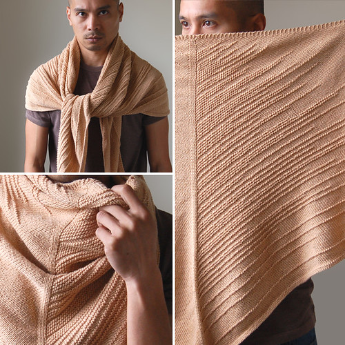
Nature inspires me, I know that's a cheesy cliche, but it's true. Nature is exploding with patterns. Like right now. I find that fascinating. A lot of my projects are an acknowledgment of these 'organic' patterns.
I'm not a scientist or a teacher or any other hero of earth. I'm just a creative person, so I recognize and demonstrate nature differently. 'Convergence' is a reference to the connections between organic pattern recognition and the creative process. It's also a reference to the merging of different skills -such as design, photography, writing and knitting- into a cohesive brand.

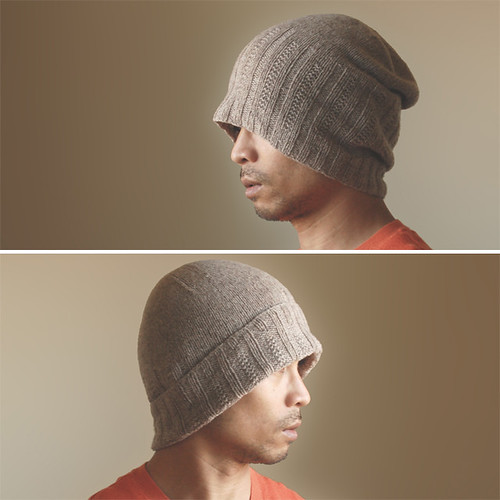
The symbols I came up with revolved around a trefoil design which I feel represent both convergence and the cohesion of organic structure. The decrease patterns of my hats are a play on this design as well. The final logo consists of a 'g' and a 'j' nested together in a trefoil shape. I still have to work out some stroked variations, but I'm happy with the result.

Hmmm... now I need new business cards.