Showing posts with label creative. Show all posts

20150202

Delete Charlie


Sometimes when I start a project, I'll blurt out my idea just to get it out of my head, and into fruition. Sometimes it's spot on in one try, and other times I have to kill the first idea and try again. That's how the creative process works. In order to create a strong body of work, you have to learn to kill your babies, specifically the weak ones. But doing the work, making that first attempt at creating what you know might die is a necessary part of the process.

So the first idea was to knit three narrow bands of garter stitch, and then whip stitch them all together. This is still a pretty solid direction, but after working on it for months, I realized how much I hated the monotony. This first version of this project was the only knitting project I had going for a while, despite the fact that I needed to be knitting hats for my Etsy shop. I was calling it "Fragments" at the time, stupid name, really.

During this time, I was also learning how to weave on a rigid heddle loom that I purchased recently. I was torn. Do I jump into a full-blown weaving project so soon after having learned the most elementary basics of plain weave? Or do I continue to bang out weaving samples parroted from Jane Patrick's book? So boredom with my first idea, and an itch to weave a twelve foot warp lead to what this project turned out to be.


And what it turned out to be is an iteration of my stash-busting series, Delete. Being the third, it is designated Delete Charlie. If you're curious, here are Delete Alpha and Bravo. The twelve foot warp I just mentioned barely diminished, shrinking only six inches to a completed length of 11.5 feet (350.5 cm). The width relaxed down to about 11 in (28 cm).

I don't remember where I mentioned this, but I don't like little tiny scarves. I don't see the point. By tiny, I mean short. This is a very subjective term, I realize, but to me the term 'short scarf' refers to anything that is under five feet (152 cm) or so. I want to drown in it. If I neglect to wrap it around me enough times, I want to be penalized by having it scoop under my feet, and trip me. But this, of course is not that type of long scarf. It could have been, but it's not.

Since this is a circular scarf, the winding around has already been taken care of. I got the idea for this peculiar spiral construction from a bag I saw on SriThreads. I'm intrigued by diagonal geometry in general, and this bag has popped into my head (and my Pinterest feed) on a few occasions. The technique is pretty straight-forward, but the tricky part was determining a reasonable width for the resulting cylinder. In this case, the circumference is about 55 inches (140 cm). I achieved this by modifying the angle to a length that was half of that. It ended up being about 28 inches (71 cm) which is slightly longer to account for some shrinkage.


As far as the seaming goes, I attached selvedge loops to one another as if to introduce a new warp yarn. This created some interesting discrepancies where selvedges of alternated colors met stripe sections along the spiral seam. Because of the slight differences in yarn sizes, there were differing weft heights being joined together. This resulted in portions that looked like deflated balloons, or under-stuffed pillows. I remedied this with little armies of running stitches. It's reminiscent of English smocking, and Japanese sashiko, and the visual texture it created really brings the beauty of plain weave up (quite literally, I suppose) to another level.


I look back on the knitted thing that this piece could have been, and it's so boring in comparison, so ugly. That first idea had to die in order for this one to live. Being creative means having the ability to generate so many ideas that killing some of them is only natural. Additionally, it would be quite arrogant to presume that every idea is good enough to keep. Coming up with bad ideas is just as important as coming up with the good ones. It's all part of the process.


Here are the yarns I used: Brown, Grey, Black/Bronze, Red, and a very brief appearance of Orange.

20131225

That's a Wrap


This year's Christmas wrap ended up being a no-brainer. This J Crew catalogue was fished out of my sister's recycling bin a few years ago, and filed away in one of my "re-use" stacks. I'm not sure what the paper size is, maybe an A3? I'm not sure. Anyway, with the help of a glue stick, I managed to double the area for the larger gift, and the smaller ones fit just fine with a single spread each. The ribbons (if you can call them that) are some of the leftover pages from that Gap Annual Report I used last year.

Happy Holidays!


20130415

A Little Background


I've gotten a few questions lately about photography, specifically the white background material I use in my work-in-progress shots of knitting projects. So I wanted to show you what it looks like.

This large poster was used as part of the display windows in Aldo shoe stores around 2001 or so. At the time I was working there as a stock associate, and when the time came to throw these out, I asked if I could keep a few. What struck me about them was how resilient they were, at least in terms of color quality. And considering the amount of time I've had them, I'd say that assessment was accurate. The value of the colors hasn't diminished despite being exposed to direct sunlight while hung up on my walls over the years.


But the real prize is that the back of the poster has remained a perfect cool white. I'm guessing it has everything to do with the material that the images are printed on. It resembles the white plastic used for weight gain formula jugs, but it's much more brittle. In fact, you can see from these photos where I've cracked the left margin edge (the bottom edge in these photos). Yes this one is battle-scarred. Good thing I have another one.

When I started photographing my craft projects back in 2010, I dug these out and cleaned them off. They ended up being the perfect backgrounds not only because of the white values, but because the rigidity of the material produced seamless gradients of white. They've served as backgrounds for countless photographs in the past three years, from basil to beads, and of course knitting.

Not bad for something destined for a dumpster over ten years ago.


20121221

Like a Quilt


It really is. Like a quilt I mean. Bits into strips, then strips into sheets. Come to think of it, I've never made a quilt, but I'm guessing that's what you do... maybe that wasn't a very good title if I end up being wrong. Oh well, that's how I did it. This wrapping paper is made from a Gap Inc. annual report, and an Anthropologie catalogue.

The how-to of it all is pretty self-explanatory, but one thing worth mentioning is that I used a glue stick. I've used spray adhesive before, but learned that it renders paper un-recyclable. Glues such as those found in glue sticks are fully recyclable.

I wish you all a happy holiday season!

20120509

Creative/Process


In an effort to wrangle more control over my online content, I'm examining my blog post tags. This has given me a chance to look hard at the content of this blog, and see the bigger picture. From the start this has been a place for me to share what I'm up to creatively. Very rarely have I posted something on here that wasn't created by me. Original content.

So this process of tag analysis led me to delete a few tags, and create a few new ones. The two primary content types are 'Craft' and 'Creative.' As you can see they branch out into their own subcategories. Blog posts are tagged with the primary tag, then the secondary tag, then the tertiary tag where applicable.

Interestingly, I realized the tag 'Graphic Design' was unnecessary. I didn't need it. As a primary tag, 'Creative' covered everything better, and the secondary tags proved to be more accurate. I guess that was weird to me since this blog started as a graphic design blog. I dunno, whatever. I'll be dropping a few others eventually, too.

This post is tagged with a new secondary tag that I've added, 'Process.' I hope that by sharing creative process with you that you may find it helpful in understanding your own content. I'm not gonna act like I'm the king of content or anything, I'm really not. I suck actually which is why I'm doing this in the first place.

20110914

I'm Officially Less Ghetto


I'm still a little excited from yesterday when I received my new labels in the mail. I started putting them on the existing stock as well as the private pieces I kept for myself. The hat shown in the picture is Reflect Zero. These are a great finishing touch to my stuff.

It wasn't as hard as I thought to find someone locally to do these for me, and it was an added bonus that Print for Brand offered shorter runs at a great price. Now I can say "Made in San Jose" and really mean it.

At 3/8 inch by 2 inches, these are perfect for my hats and scarves. They're small, but precise. I'm not one to be flamboyant with any of my work, and the understated reiteration of my logo type connects well with my restrained, methodical nature.

Now I don't feel so ghetto. Next big buy: some sort of packaging.

20110526

Feral


This cat was born in a patch of jade plants on the side of my house. I would see him walking past the back door, or stalking gopher holes. My interaction with him was limited to spotting him through windows and glass doors. Feral cats avoid human contact, so he'd run if he saw me.

I liked having this wild thing just wandering around out there. I never fed him or anything, it seemed like he was doing just fine on his own. I just left him alone. I never even named him.

A few weeks ago I found his body in the patch of jade plants he was born in. He must have died a while ago judging from the decomposition. I found this picture I took of him back in '06, a rare shot of him in loaf mode. Pretty handsome, eh?

I know he was just some stray cat, but I always regarded him as my little analogy. I can relate to being resourceful enough to survive, and living this simple life untethered by human connection, yet appreciated from afar. He was wild and free. To me that's a pretty awesome life.

20110423

Self Edit

I'm really not sure why I've put this off for so long. Over the past few years I've been half-assing my logo in an attempt to get 'something' up and be done with it. Maybe I just didn't want to subject my personal brand to the same critical examination as my past clients. Or maybe it was out of laziness, who knows. In truth it was a refreshing change from all the knitting. Applying the creative process to my own content has been liberating in a way. I always used to do this for someone else.


Logo design is all about coming from a conceptual place which is why I like it so much. It starts (for me anyway) with a list of words. What's the gridjunky brand about? Is there a recurring creative theme? What words characterize your skill set? From about twenty or so words, mine ended up being: 'Organic' & 'Convergence.'

Nature inspires me, I know that's a cheesy cliche, but it's true. Nature is exploding with patterns. Like right now. I find that fascinating. A lot of my projects are an acknowledgment of these 'organic' patterns.

I'm not a scientist or a teacher or any other hero of earth. I'm just a creative person, so I recognize and demonstrate nature differently. 'Convergence' is a reference to the connections between organic pattern recognition and the creative process. It's also a reference to the merging of different skills -such as design, photography, writing and knitting- into a cohesive brand.


The symbols I came up with revolved around a trefoil design which I feel represent both convergence and the cohesion of organic structure. The decrease patterns of my hats are a play on this design as well. The final logo consists of a 'g' and a 'j' nested together in a trefoil shape. I still have to work out some stroked variations, but I'm happy with the result.


Hmmm... now I need new business cards.

20101029

Packaging Postulations

So I've been tossing around ideas for product labeling on my hand knits. Today I tried out a knitted label. It took a while, I'm thinking maybe too long. I think it's cute, but I don't know if I can handle doing it for every piece I produce. I'm meticulous, but I don't have all the time in the world.


Fortunately for me my cards arrived. I ordered these last week from PSPrint. They have a deal for business cards right now, so I jumped on that 40% off for a short run. I think I'm just going to attach these rather than torture myself knitting thread weight yarn.


Are you familiar with Etsy Treasuries? They're these collections of items compiled by members under various themes. I first heard about Treasuries when I got featured in one earlier this week, then another. I was like: "I'm featured in a what?" Have a look, and leave a comment.

20100612

illustration: Shuffle

Shuffle

I like deconstructing things and examining the pieces in new arrangements. This image consists of elements generated in Savagery. I used just one layer of objects and proceeded to shuffle, prod, scale and arrange the objects like I was in kindergarten again.

20100520

Restrained Clarity

Graphic design is all about the message. If you aren't saying anything, you're demonstrating nothing. If you have something to say, communicate it with eloquent clarity. Form it, nurture it, groom it, clarify it, and let it out.

I like the idea of having something there, behind the eyes, waiting to bust out, but restrained, waiting for the right moment. It's not about the release, it's about control.

Jerome Robbins nailed it with a stunning piece of choreography in West Side Story. After the loss if their leader, the Jets are off balance, confronted by fear, regret, anger and sorrow. On top of that, they have to deal with the cops. With so much raging inside, and so much riding on it outside, the best thing to do is "be cool."

Before the action, before the idea springs from your mind full blown into the world, just before it explodes, grab it. Pull it back. Then slowly let it go and examine it as it passes softly through you.

20100425

illustration: Savagery Wallpaper

DirtBoy 1024x768

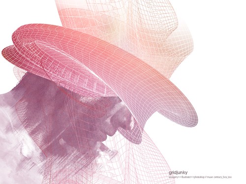
I was messing around with Savagery lastnight and made a wallpaper.
The image I used is from century_boy_too.
Click the image above for the 1024x768.

20100419

photography: Another Backyard Resident

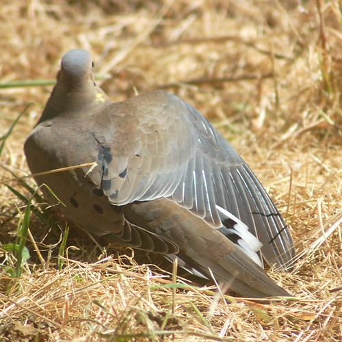
A dove in my backyard.

Today I noticed another Backyard Resident. There were three of these doves poking around for bugs in the backyard. They saw me on the other side of the glass door, but I guess they still felt safe. I was able to grab my camera, pop on a zoom lens, and get a great shot.

I love the warm and cool grays in the plumage. There must have been lots of bugs to eat out there because these guys hung out for a while.

20100415

sketchbook: Practicing Hands


I've been working on the untitled illustration I started last week, focusing on the deer head section in Adobe Illustrator. Today I started sketching out arms and hands. I like the initial sketch I started off with, but I felt like getting more practice with the proportions and masses of these highly expressive parts of our bodies.

The references I used were found in Hand Signals & Gestures:
century_boy_too
devoncummings
modenaroid

20100410

photography: A Backyard Resident

Backyard Resident

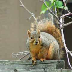
This is the first time I've been able to get a shot of one of the squirrels running around in my back yard. Typically I can't fetch my camera fast enough to snap a picture before it's gone. I guess today was my lucky day.

20100402

illustration: Untitled


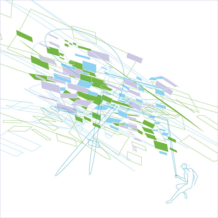
Now that I've finished my knitting projects I'm in the mood to do an illustration. Honestly I don't really know where I'm going with this particular image, it's more a representation of how I'm feeling lately. I wonder why I feel like this....

20100327

sketchbook: March 18, 2010

It's been a while since I've posted any drawings, so here's a bear taking a nap.